It began as a whisper — the kind of odd rumor that slips between airport employees during long overnight shifts.
Someone claimed that the restroom signs we all take for granted weren’t designed for convenience at all. Instead, they were supposedly based on an old coding system from 19th-century European rail stations.
It sounded like a conspiracy theory wrapped in graphic design.
And then I started spotting something strange.
No matter where I traveled — from tiny cafés to major transit hubs — the same “WC” letters appeared. Not English-speaking cities. Not Western-only regions. Everywhere. Identical markings in places that had no reason to use them.
That was the moment I realized restroom signs weren’t just symbols… they were a language. A hidden one we’ve been fluent in since childhood.
Here’s the story behind those little icons we follow without thinking.
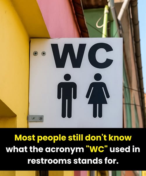
1. Why WC Exists at All
WC stands for Water Closet, a designation invented in Victorian England. At the time, the idea of a private indoor room with a flush toilet was almost luxurious. The phrase distinguished these new “indoor toilets” from outdoor outhouses.
The term faded from everyday speech, but its tidy abbreviation survived — hitching a ride across Europe, then airports, ferries, resorts, and eventually the entire world.
Today, millions recognize WC instantly… even if they’ve never once said “water closet” aloud.
2. The Many Names for the Same Essential Room
Bathroom language changes as fast as geography:
Restroom / Bathroom — United States
Washroom — Canada
Loo / Toilet — United Kingdom
CR (Comfort Room) — Philippines
Toilettes — France and French-speaking countries
Damentoilet / Herentoilet — Netherlands (direct, practical)
Travelling with only words is a gamble. That’s exactly why visual symbols became the world’s shared safety net.
3. The Rise of Universal Icons
To solve the language problem, designers stripped the idea of “bathroom” down to its simplest visual form:
two stick figures — one in trousers, one in a skirt.
Were the designs stylistically exciting? Not really.
Were they instantly readable from 20 feet away? Yes. And that’s all that mattered.
These icons were engineered to do three things:
break through language barriers
stand out in chaotic, crowded environments
be recognized in less than a heartbeat
Even today, global airports and train stations rarely deviate from them. In emergencies, confusion isn’t an option.
4. When Creativity Backfires
Some cafés and boutique hotels love to reinvent restroom signage. One bathroom might use hats and mustaches; another uses stilettos and lipstick; a third uses animals, musical notes, or abstract shapes.
Charming? Sure.
Helpful? Not always.
Nothing stops a confident stride quite like the sudden fear of choosing the wrong door.
That’s why major public spaces avoid cleverness — visitors shouldn’t need a puzzle-solving moment when nature calls.
5. Politeness vs. Directness in Bathroom Language
How cultures label their restrooms reveals subtle attitudes:
“Restroom” in the U.S. softens the subject.
“Toilet” in the UK is fully acceptable — direct, not rude.
“WC” across Europe and Asia remains neutral and functional.
These preferences reflect national tendencies toward modesty, frankness, or simplicity.
6. The Shift Toward Inclusive Symbols
Restroom signage is evolving once again — quietly but steadily. Many public spaces are adopting:
single-toilet icons
simplified human figures
“All-Gender Restroom” text
icons with merged silhouettes
The goal: make facilities easier to access and safer for everyone, regardless of gender identity or expression.
Design is no longer just about clarity — it’s about respect.
7. A Universal Visual Code
Next time those two letters — WC — glow above a doorway, consider this:
You’re looking at a symbol shaped by centuries of plumbing innovation, cultural norms, graphic design, and global travel. A tiny sign that survived linguistic divides, airport chaos, and endless reinvention because it does something astonishingly well:
It tells every human, in every country, exactly where to go.
You may call it a washroom, bathroom, loo, restroom, CR, or toilette — but the icon speaks a language we all understand without thinking.
And that might be the most successful piece of design in the world.
Conclusion
Restroom signs seem ordinary, almost invisible. But their journey from Victorian “water closets” to modern, inclusive icons reveals how language, culture, and design collaborate to solve a universal need.
WC markings and pictograms became global standards because they’re fast, neutral, and unmistakably clear.
As the world continues shifting toward more inclusive spaces, our bathroom signs will evolve with it — but their mission will stay the same: help every person, in every corner of the world, find the door they need when it matters most.